Mirror Responsive Website
Background
Mirror is a successful brick and mortar brand with over 400 stores around the world, in 32 countries. Mirror started back in 1994 as a clothing store targeting an audience looking to make good quality, yet affordable clothing accessible for all.
Overview
-
The Project
Design a responsive webpage that is visually appealing, modern, and minimal, including branding and logo design. As well as taking this company as an established brick and mortar and introducing them as an ecommerce site with a strong presence that appeals to all consumers.
-
Research Objectives
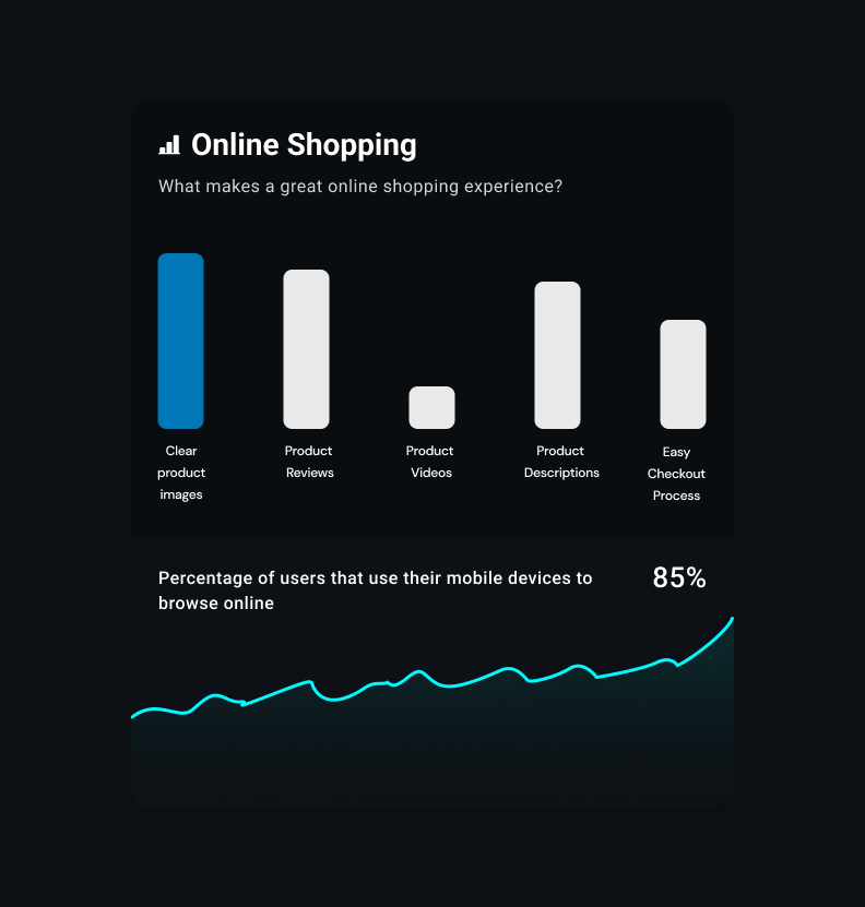
Identify and clarify existing pain points users face when online shopping. As well as identifying what users enjoy, to add ease of use and an overall streamlined experience. Discover what makes for a reliable and pleasant experience to build loyalty as well as trust to establish repeat customers, in turn also establishing trust with stakeholders and clients.
-
My Role
User interviews, journey maps, insights and artifacts, wireframes, visual design, interactive prototypes, usability tests, from beginning to end and finishing with the final product.
Research
Secondary Research using competitive analysis.
Individual Interviews with 4-6 participants
Online surveys to cast a wider net.
Research Findings
-
Access
Many users will delete an infrequently used app off of their phone to make space. They will also immediately remove an app if they find that the sign up time and function is too slow or faulty.
-
Competition
Most users found the mobile app of other competitors to be frustrating, and mainly use the website, but have built brand loyalty in consistency in other areas.
-
Markets
More users are shopping online now more than ever. Digital commerce is projected to maintain it’s upward trend with ecommerce becoming the new normal.
-
Social Media Selling
Social selling via mobile has become the primary retail purchase method with 67% of retail sales coming from mobile and social sites in 2021.
-
In Store Purchases
In store shopping however has also increased. With things like curbside delivery, in store shopping has advantages that are impossible for ecommerce, for example being able to physically interact with a product as well as the feeling of instant gratification.
-
Growth
Users are looking for consistency, reliability, and ease. As well as the flexibility of being able to shop online, in store, or a hybrid.
Looking at consumer spending, its continued rapid trends and transformations from mobile commerce to social selling as well as political motivations can give us a good idea of what priorities and directions we can look to in the future.
Insights Gathering
Collected survey responses after the individual interviews as part of the individual interviews to learn more about why and what they enjoy about online shopping.
Mapping User Needs to Features
From the individual interviews, I identified unmet user needs, user pain points, and key features users look for as part of their online shopping experience to determine which features drive growth through consistency and recognition.
“I had been a decades long, loyal card carrying customer until one single interaction where they shamed me for returning items. ”
UX Principles
-
Usability
Goal is to create a memorable shopping experience simply by being consistent in order to minimize confusion.
-
Inclusivity
Be accessible to anyone who wants to go through the process and ease of use of being able to access every interaction and function of the website.
-
Simplicity
Aim to start with a limited amount of banners, windows, and options to understand how new features impact retention.
Wireframes
-
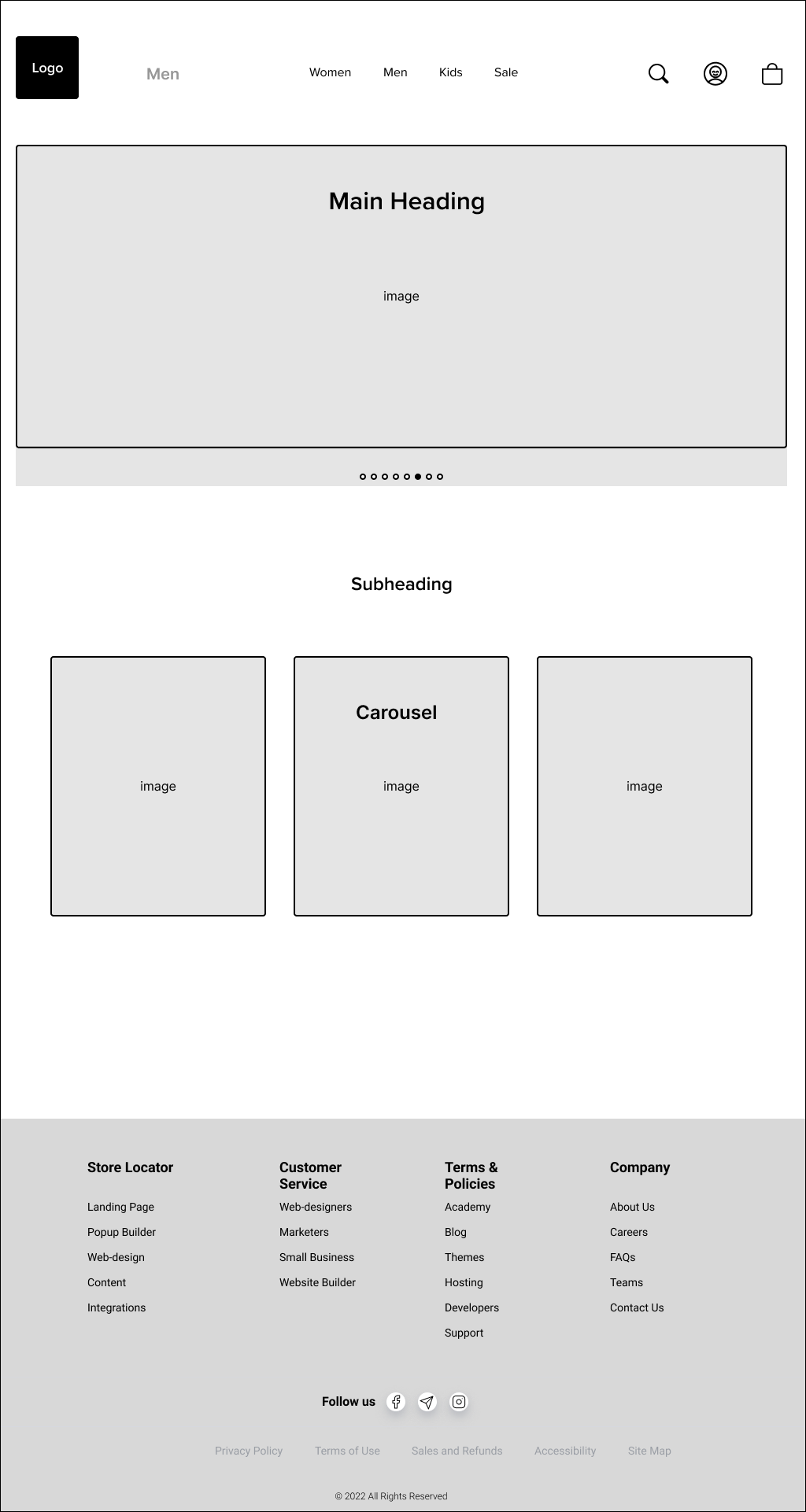
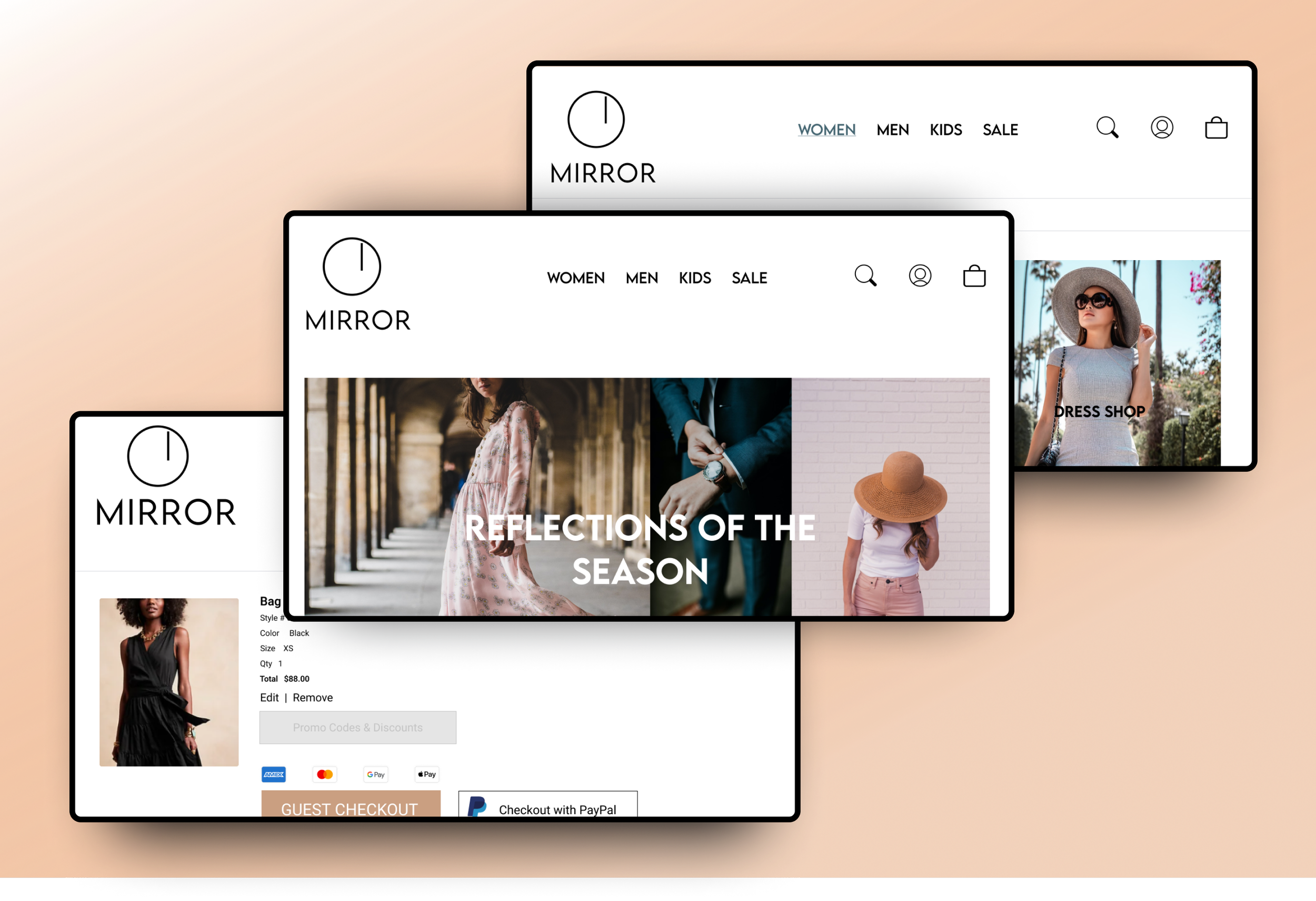
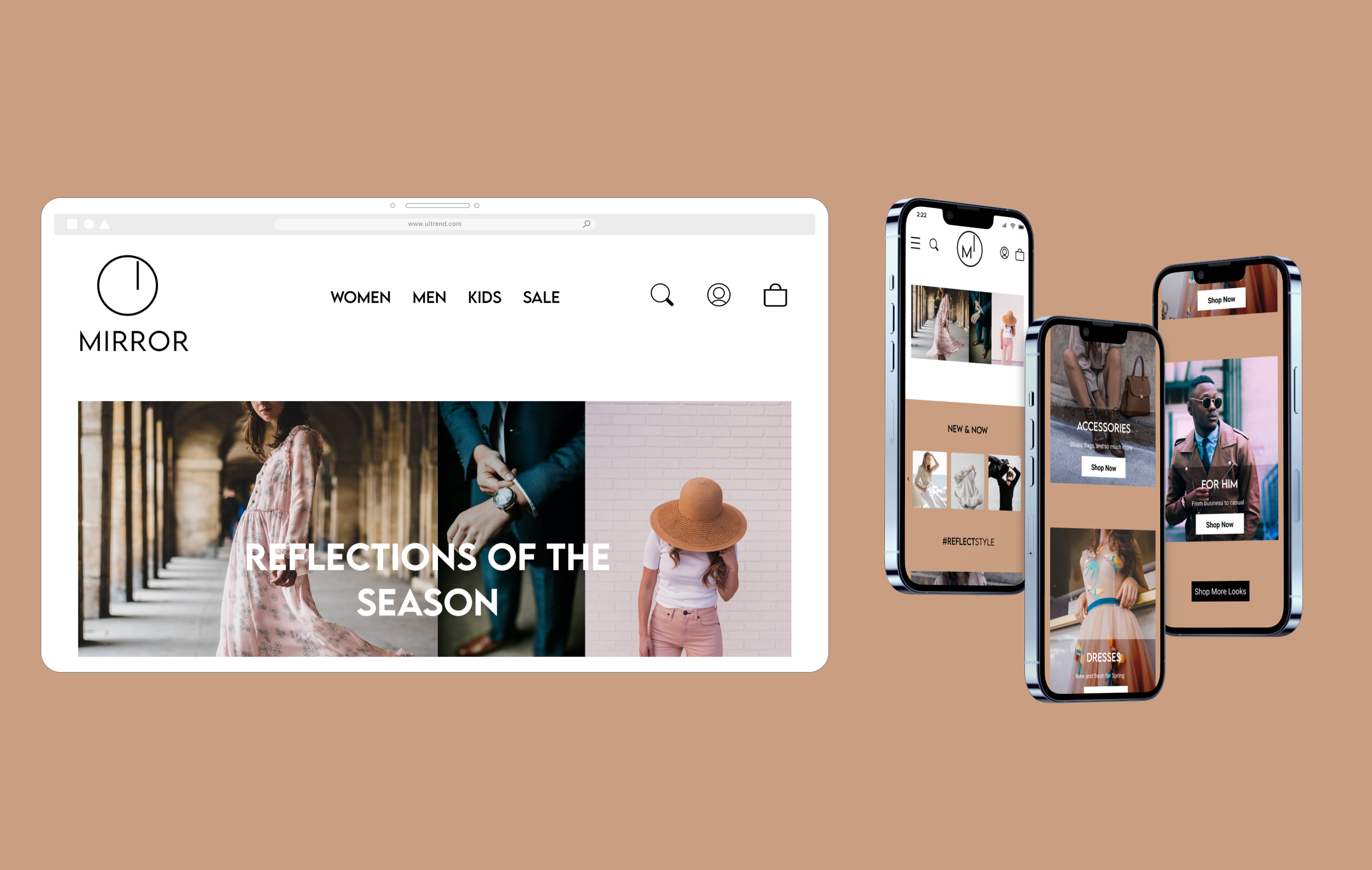
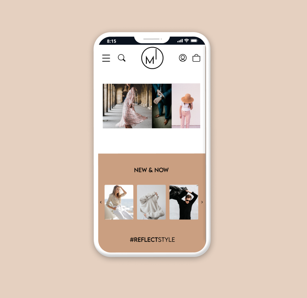
Responsive Wireframes
Responsive wireframes built for Desktop, Tablet, and Mobile.
-
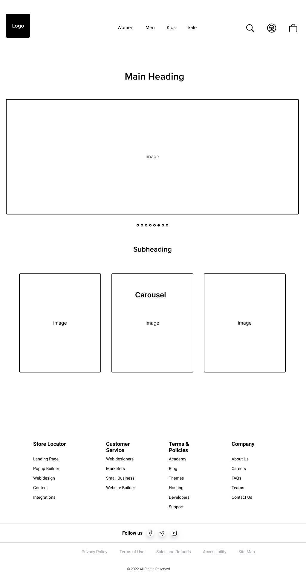
Wireframes
Wireframes based on previous iterations focusing on desktop design. Landing Page, Category Page, Product Page.
-
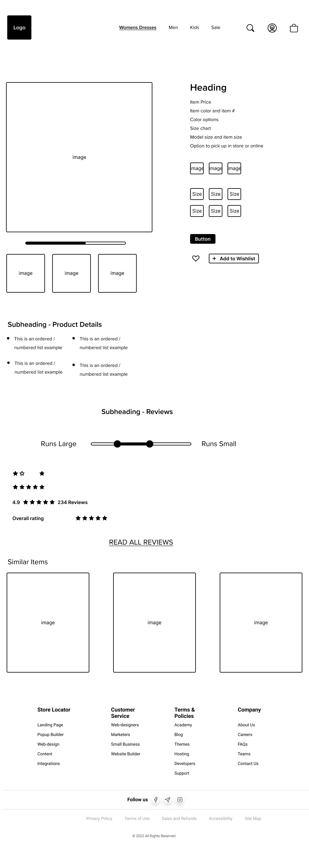
Product Page
-
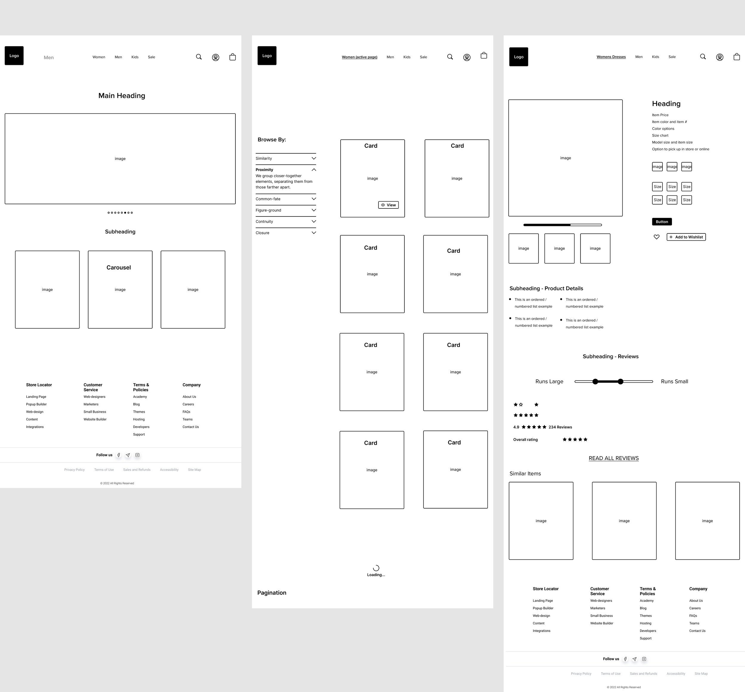
Landing Page
Category Page
Product Page
After several wireframe iterations focusing on the user feedback from one on one interviews, surveys, and competitive analysis, I then developed my prototypes for testing interviews at an early stage.
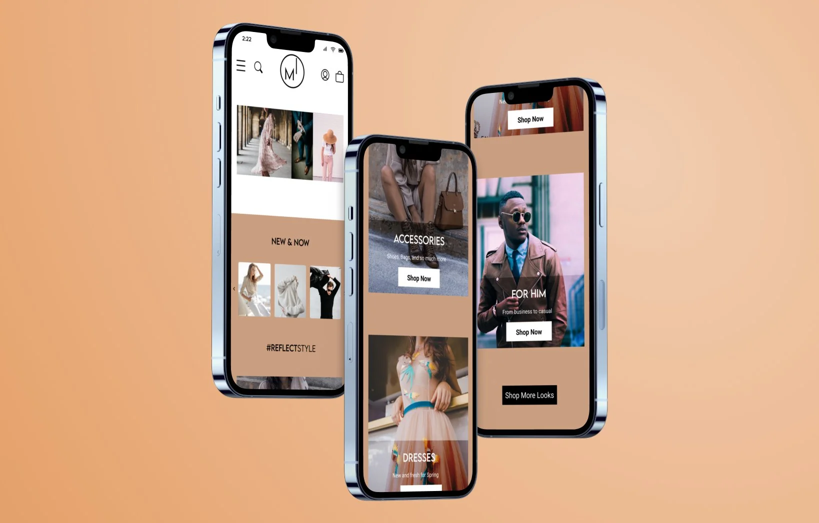
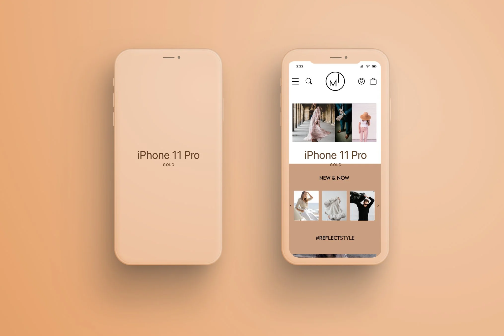
Mirror Visual Identity
Minimal. Clean. Modern.
Style Tile & UI Kit
-
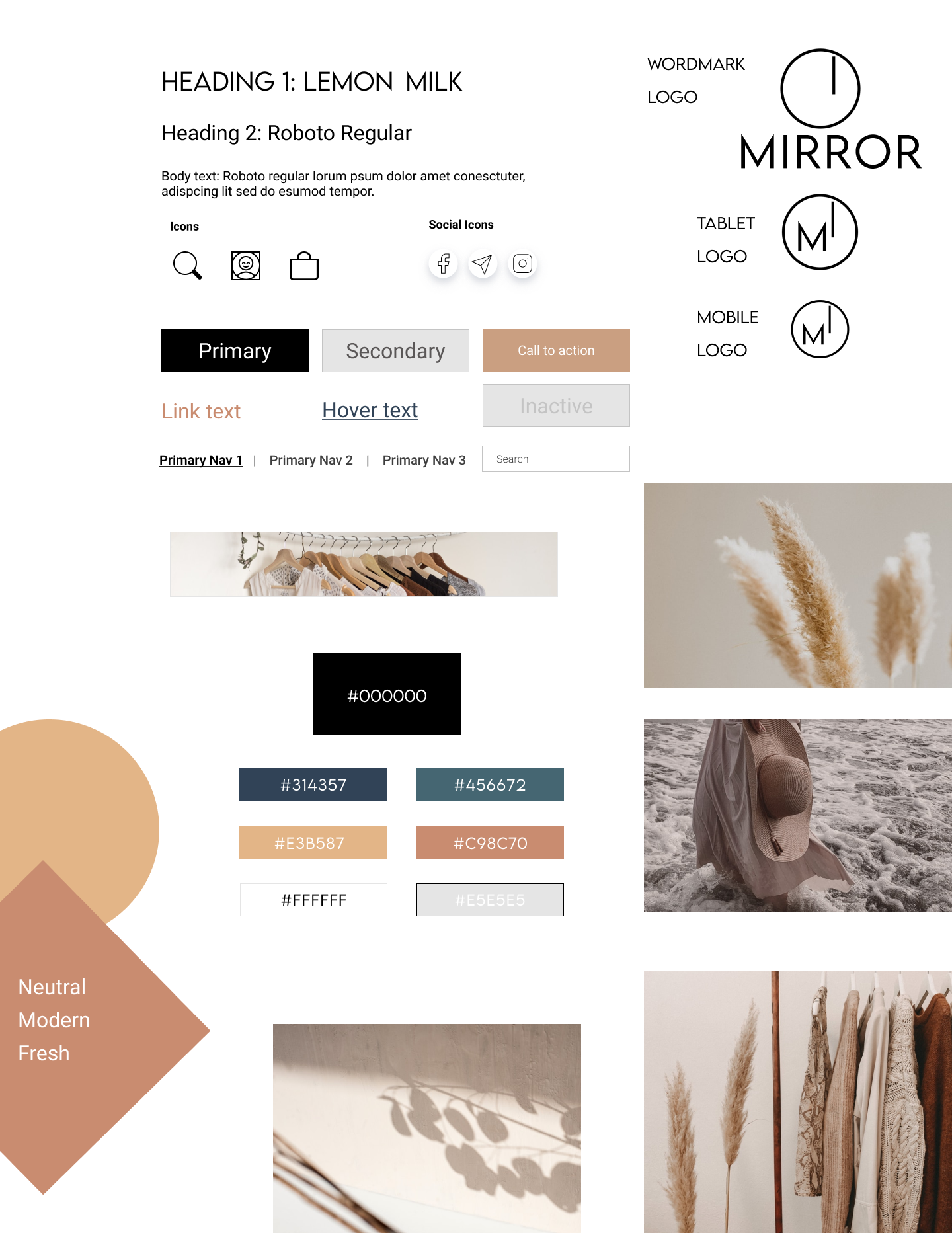
Style Tile
-
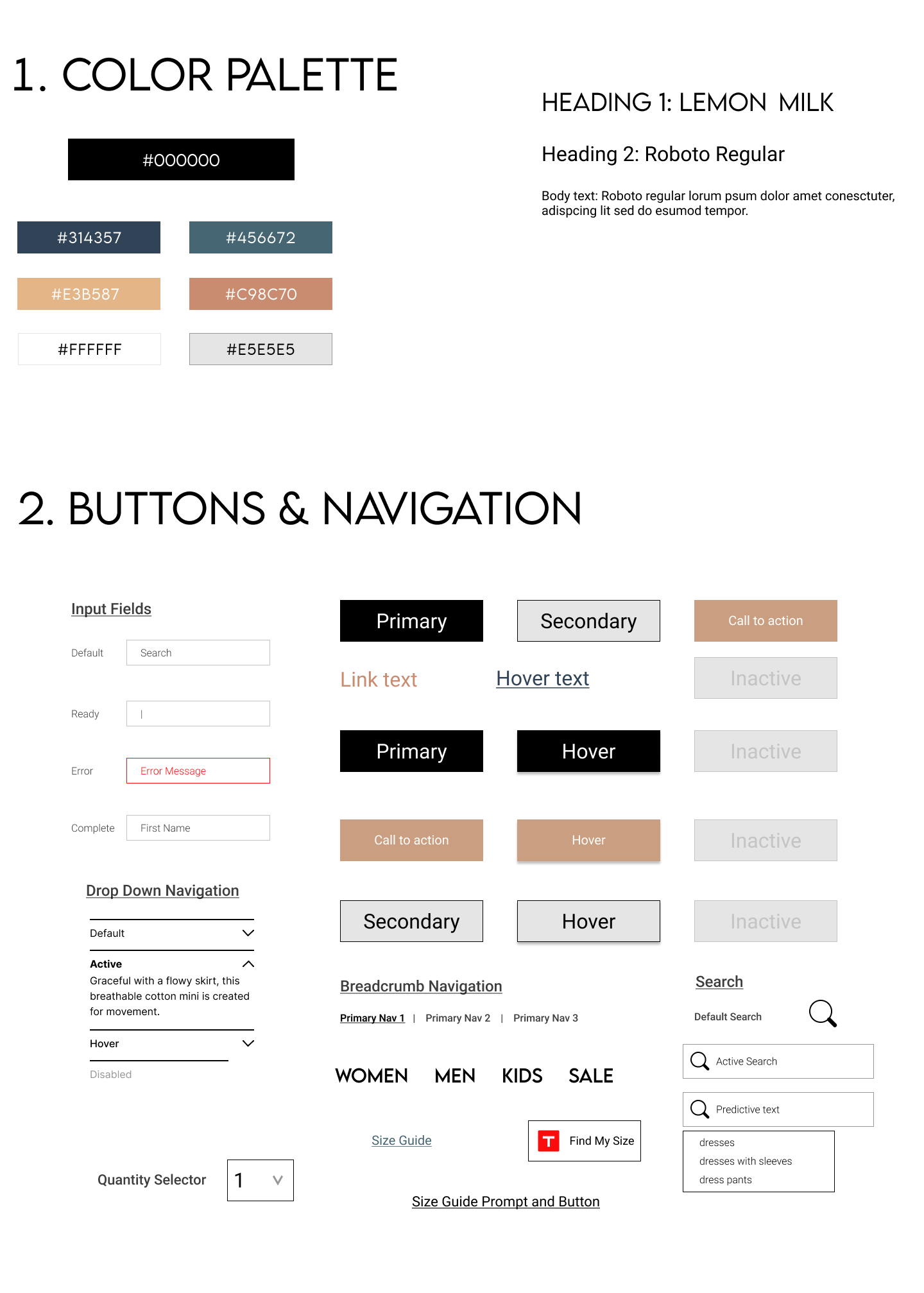
UI Kit
-
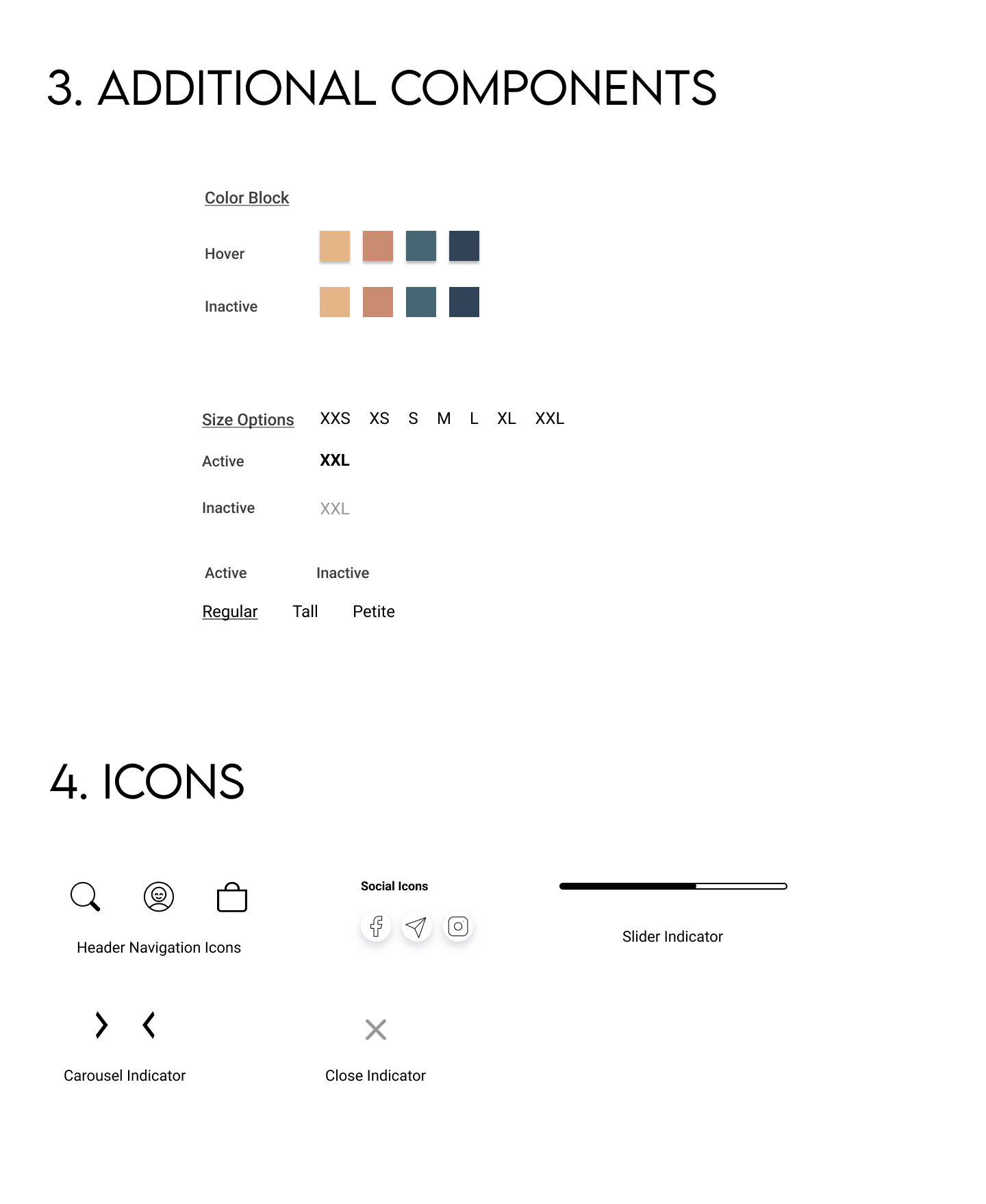
Additional Components & Icons
Outcome
-
Research
Over the course of three weeks and a total of 10 participants I was able to conduct multiple research methodologies, create Personas and Empathy Maps.
-
Information Architecture
With the pain points and highlighted details as to what makes for an efficient online shopping experience for the users I was then able to use card sorting, page sketches, and sitemaps to get a better idea of the user journey within the website I was about to create.
-
Interaction Design
Using task flows, user flows, wireframes, responsive wireframes, and finally a prototype I started to form the final project. Testing the wireframes and prototypes early and often.
-
Design, Iteration & Implementation
The final stages included creating a high fidelity prototype, usability testing and affinity map. Taking all of this information into the final iteration of the website.
Conclusion
This project from start to finish was fascinating and engaging. The user interviews gave me so much insight into the user experience of something that may seem like a simple task but is so much more. From there I was easily able to create a persona and take that persona with me through the entire process of the project in order to keep consistent with the goals of the client but also to keep consistent with empathy for the user.
The data and research was fascinating as to every detail that goes into creating an “experience” for the customer and I am so thrilled to be a part of a project like this.